Findability First: Shaping a Clearer Path for eazle Customers
Improved product discovery across eazle by rethinking how customers search, browse, and reorder — especially in mobile-heavy, high-volume markets.
Challenge
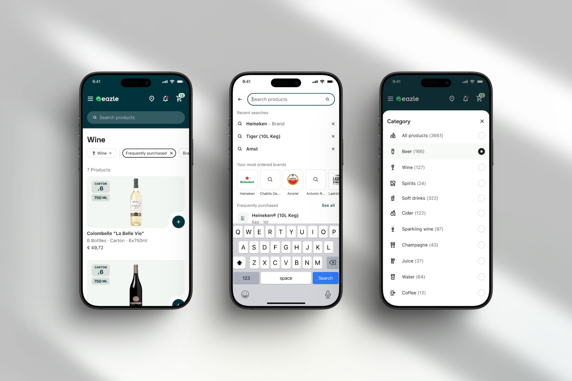
eazle serves thousands of B2B customers across very different markets — but the ordering experience often started with the same problem: Where do I find what I need?
Many customers weren't exploring at all. They were hunting for specific SKUs they already knew.
- In some markets, 90%+ of users reordered the same few products over and over.
- In others, buyers needed to switch outlets or browse across multiple distributors.
The core challenge wasn't about UI polish. It was about mental load. We needed to make product discovery feel fast, predictable, and relevant — even when the business logic underneath was messy.
Approach
I partnered with product leadership to shift the team's focus from 'adding features' to 'reducing friction.' That meant auditing the full journey — not just PLPs and search bars, but also reorder flows, entry points, and outlet switching.
We ran focused research in key roadmap markets like Brazil, Nigeria, South Africa, and France. Patterns emerged quickly:
- Customers wanted quicker access to their repeat orders
- Many didn't trust search unless they saw something familiar right away
- Distributor logic was often unclear, especially for users managing multiple outlets
I worked with the design team to refactor core surfaces based on these insights:
- We added reorder modules directly to the order history page
- We improved search suggestions
- We clarified outlet/distributor switching to reduce confusion
All of this was scoped with engineering early to ensure we could ship iteratively, without breaking the platform's flexibility across markets. We also ran lightweight testing in high-volume countries to validate clarity improvements before rollout.
Outcome
The improvements shipped in stages and began surfacing across live markets within the quarter. Early signals showed:
- Increased engagement with search and PLP
- Reduced search abandonment in mobile-first regions
But more importantly, the team began treating 'findability' as a product problem — not just a UX one. Designers and PMs started asking better questions: What's the fastest path to reorder? What signal tells the customer they're in the right place?
Impact
This work gave us a clearer mental model for how customers approach eazle — especially under pressure (busy bar, low inventory, poor connectivity). That shaped how we prioritized future UX improvements and helped reset the team's expectations around what "good" looks like: less navigation, more clarity, fewer taps.
Key Learnings
When you're building for behavior, not just conversion, simplicity matters more than flexibility. The most powerful features are the ones that feel invisible — because they show up exactly when the user needs them.