Mobile Filters at Booking.com
I was the UX Designer on the Search Results team at Booking.com for three years. I was the only designer on this project, collaborating with our PM, front-end, and back-end engineers.
Impact TL;DR
Three controlled experiments increased overall conversion by 0.52%, raised filter usage by 0.74%, and lifted bookings after filtering by 1.66%.
Problem
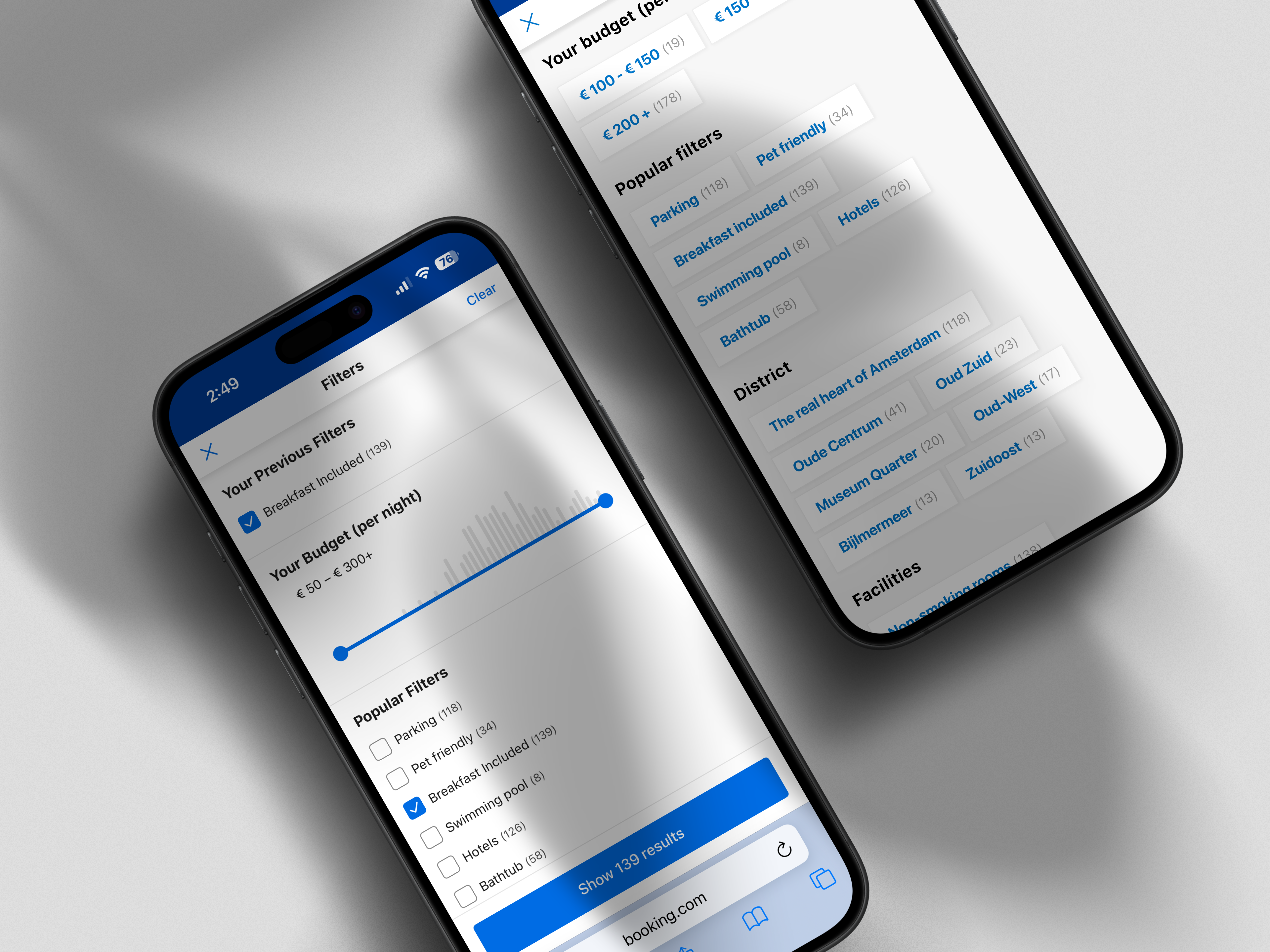
Mobile users filtered less and converted worse than desktop. Multi-select was frustrating and filters were hard to find.
Why It Happened
The masonry layout made scanning slow. Each selection kicked users back to results. Adding a second filter required reopening the panel and restarting.
Strategy
I ran three separate, sequential experiments in production to reduce effort without adding options, isolating impact by shipping each inside system components.
Experiment 1
I replaced the masonry grid with vertical checklists to speed scanning and enable true multi-select. Usage rose, but over-filtering created zero-result risk.
Experiment 2
I kept users in flow with a persistent filter screen and clear Clear and Close actions, so they could add or undo multiple filters without bouncing to results.
Experiment 3
I combined vertical checklists with the persistent screen and contextual navigation to balance speed and control.
Key Decisions
I prioritized persistent filtering over instant return to results. I chose design system components to ship quickly and measure cleanly. I moved global navigation actions into clear contextual actions.
Final Experience
Users scan vertical lists, select multiple options in one place, and stay in flow with predictable Clear and Close. Attention stays on results, not UI management.
Outcome
The combined effect of the three experiments led to improved conversion, increased filter engagement, and mitigated zero-results.
• 0.74% Filtering usage
• 1.66% Booked after filtering
• 0.52% Overall conversion increase
What I Learned
Make the task easy, then design for the extra usage it creates. Recovery patterns like Clear prevent dead ends, keep state consistent, and preserve performance and clean metrics.
What I learned
Make the task easy, then design for the extra usage it creates. Recovery patterns like Clear prevent dead ends, keep state consistent, and preserve performance and clean metrics.